


CI
Word Mark
The WORD MARK of HYUNDAI ROTEM uses solid gothic typeface that gives an image of confidence. The motif above the ‘t’ symbolizes the image of Hyundai Rotem, which is rapidly growing based on innovative high technology.
The blue color represents cutting-edge technology and a bright future, and the red color represents the initiative and infinite energy of the company's members.
Logotype
As the logotype is an important basic element that conveys the image of Hyundai Rotem, it is designed to harmonize with the image given by the word mark. It is proportionally adjusted according to the shape of each typeface, so you should not arbitrarily change the font, thickness, proportion, etc., of the letters.
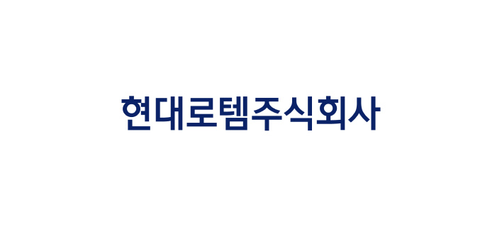
Official name in Korean
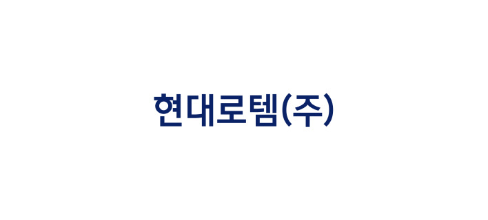
Abbreviated name in Korean

Official name in English
Signature
These are intended to more actively unify images by combining word rmark and logotypes systematically and effectively. Signatures can be appropriately selected and utilized depending on the situation.
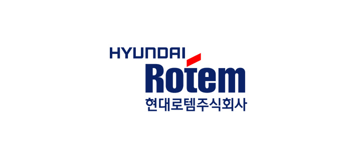
Top and bottom combination of the basic Korean formal name
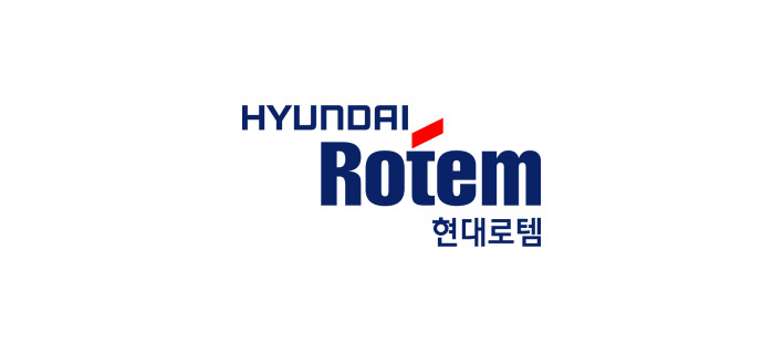
Top and bottom combination of the basic Korean abbreviated company name
Top and bottom combination of the basic English formal name
Color System
Color is the visual element that is recognized first among the many graphic elements and has a very high level of discernment. Therefore, when expressing colors in productions, care must be taken in color selection and color arrangement to maintain Hyundai Rotem's unique image.
Rotem Blue
PANTONE 288C
C100 M70 Y0 K30
R10 G35 B105
3M SCOTCHCALFILM 3630-15
R10 G35 B105
3M SCOTCHCALFILM 3630-15
Rotem Red
PANTONE 186C
C0 M100 Y100 K0
R255 G0 B0
3M SCOTCHCALFILM VT2741
R255 G0 B0
3M SCOTCHCALFILM VT2741